Lavender
Visual identity
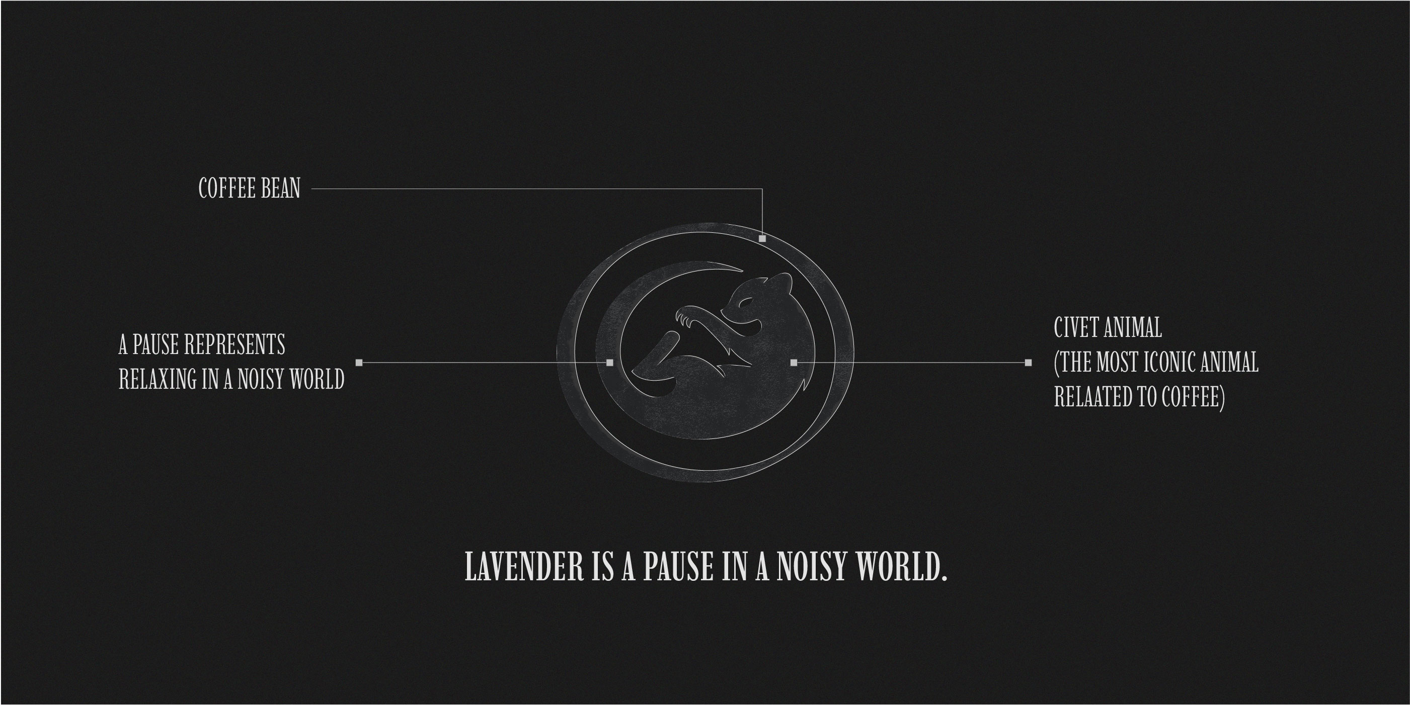
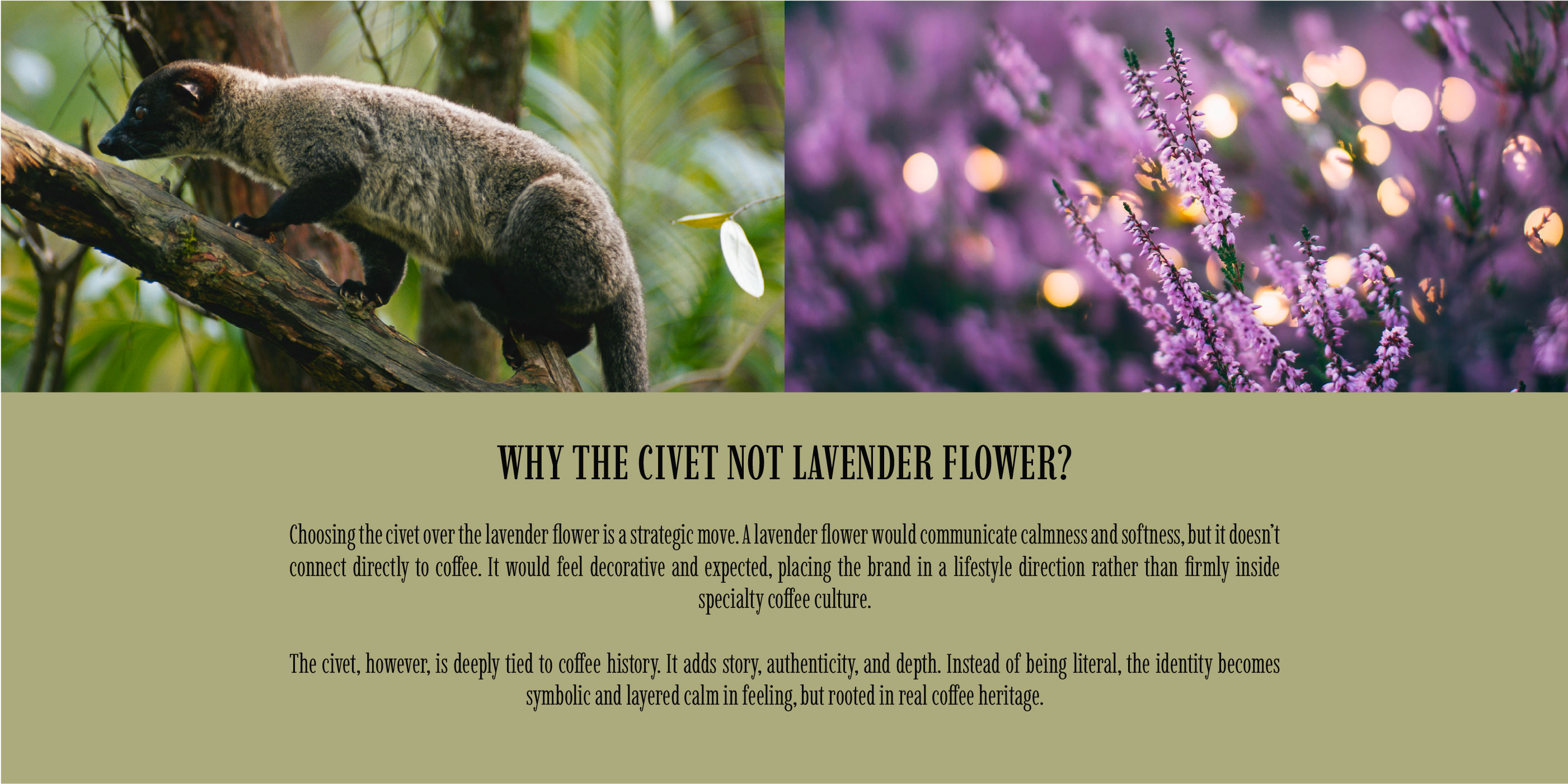
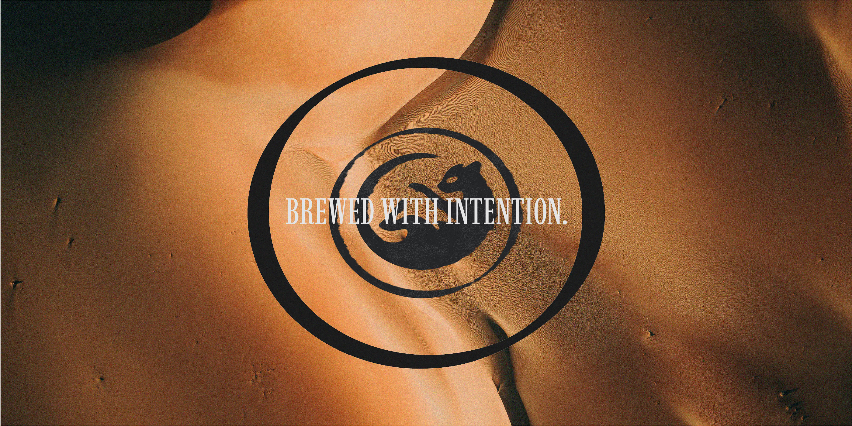
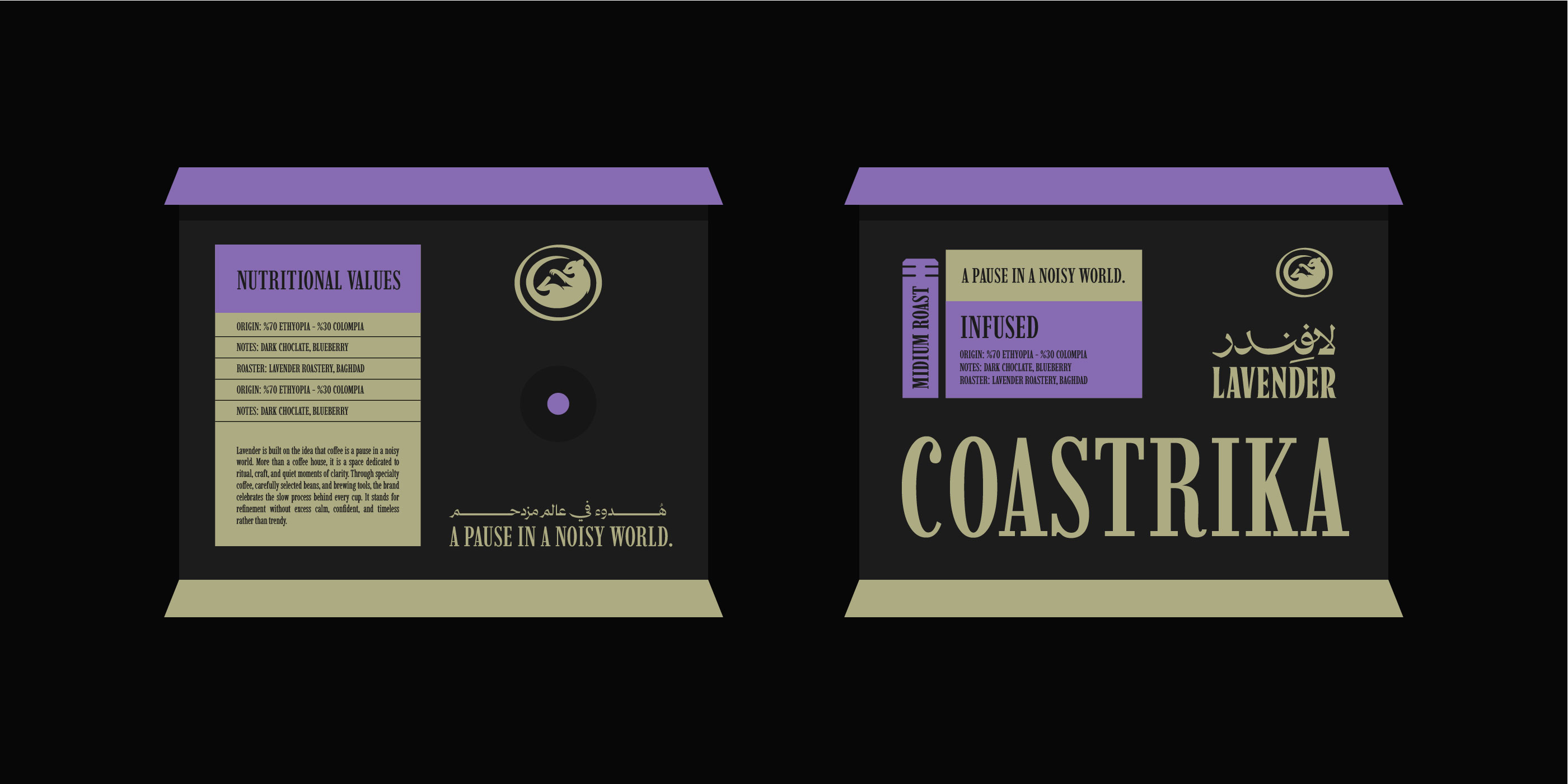
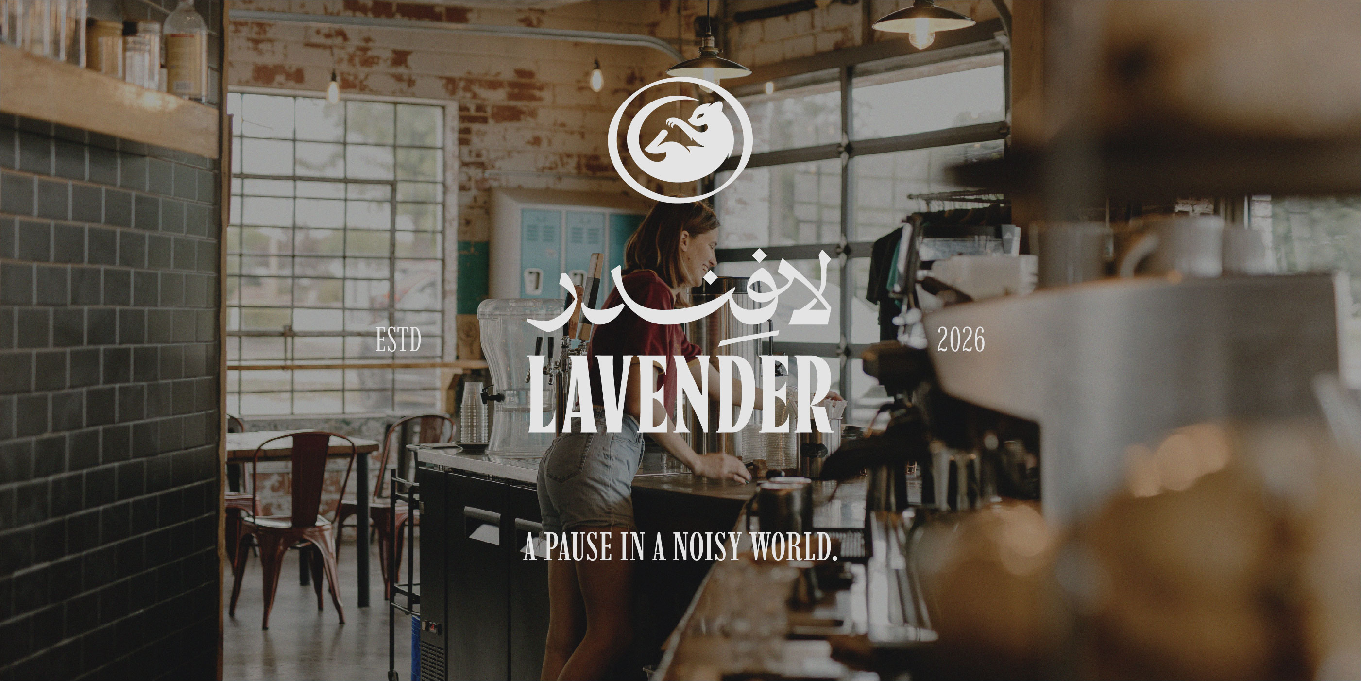
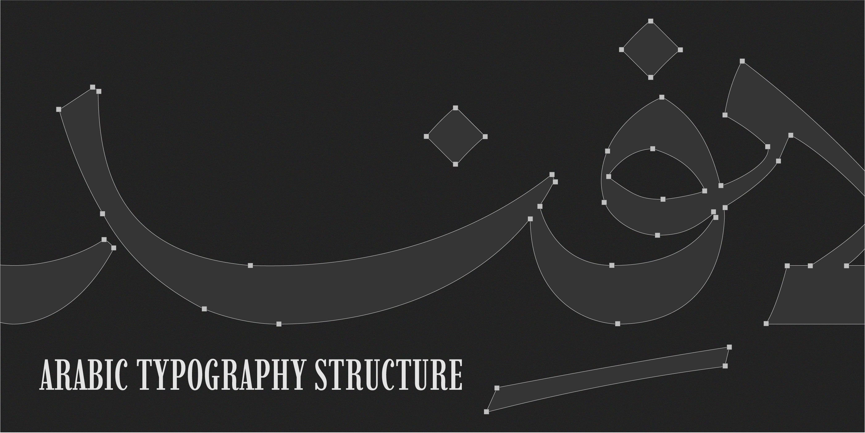
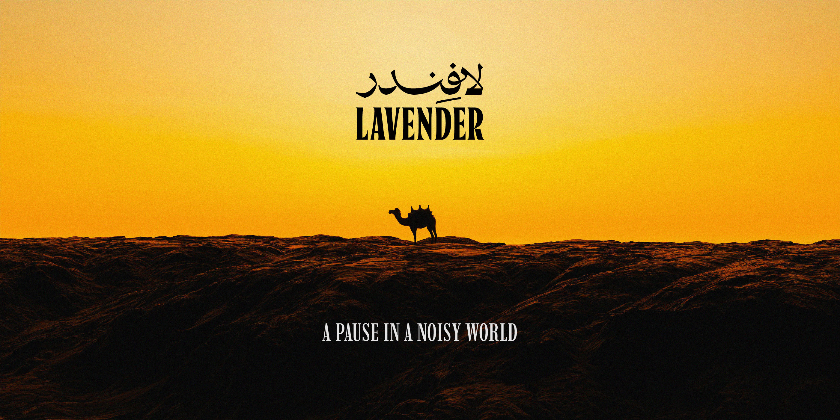
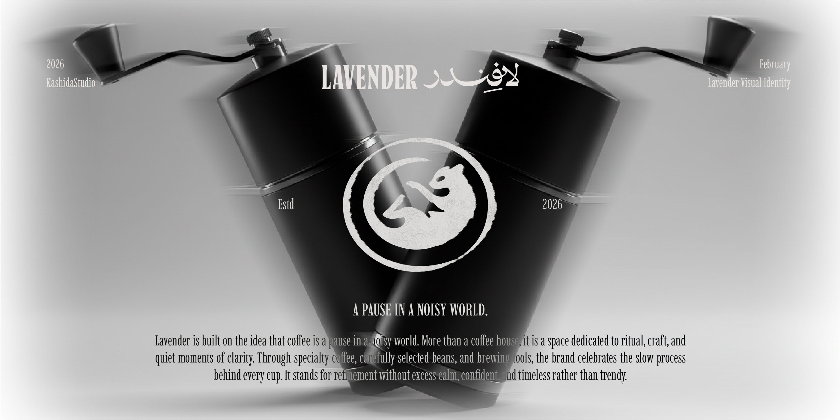
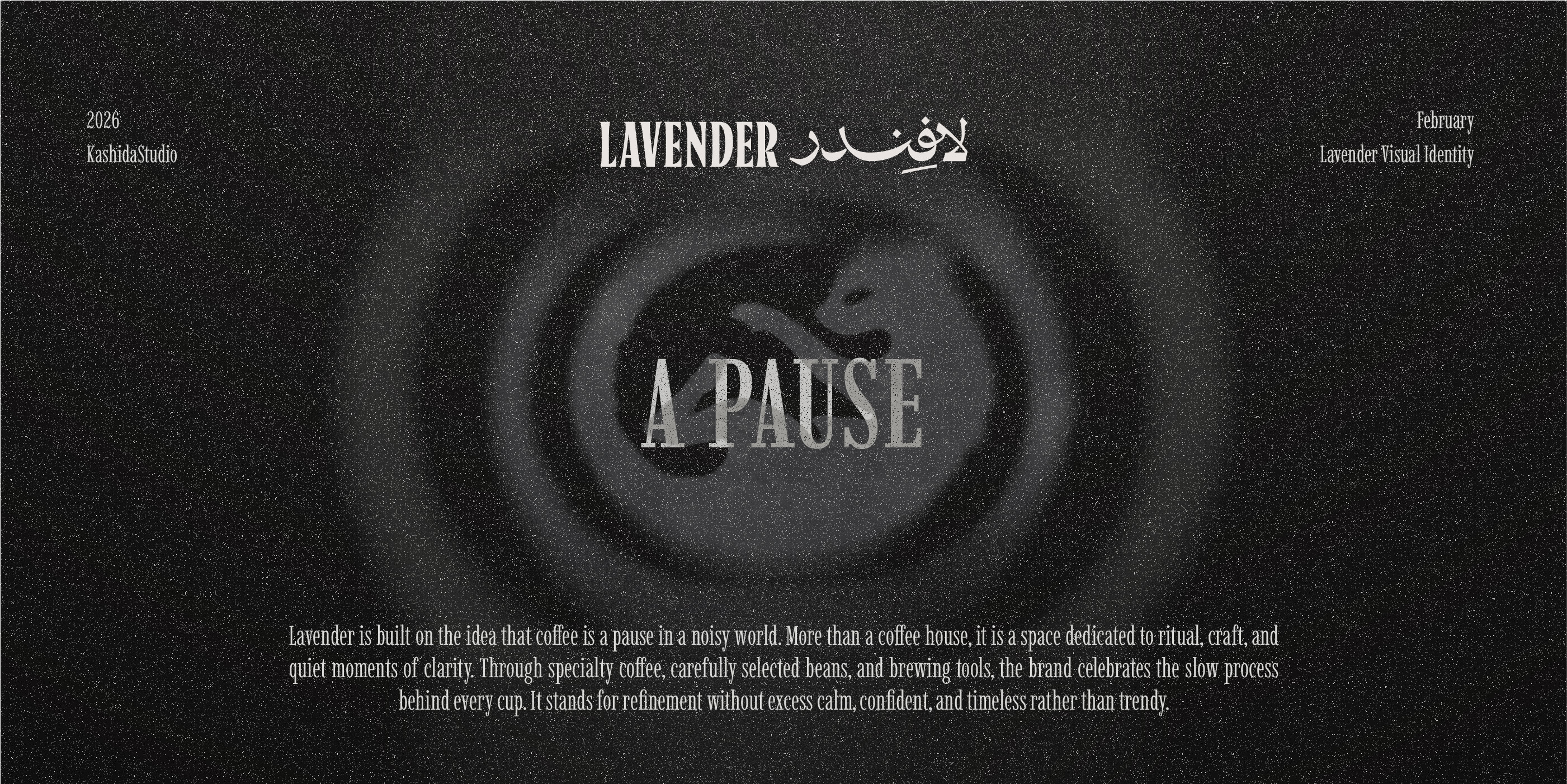
Lavender Coffee is built around the idea of pause — a quiet moment in the middle of a fast, noisy world. The brand goes beyond simply serving coffee, focusing on the ritual behind it: the process of grinding, brewing, and slowing down. Through carefully selected beans, thoughtfully chosen tools, and a deep appreciation for coffee culture, Lavender creates an experience that feels calm, intentional, and refined.The visual identity reflects this philosophy through simplicity and meaning. At the core of the mark is the civet — a symbol deeply connected to coffee history — represented in a minimal, relaxed form to express comfort and stillness. Enclosed within a circular structure inspired by the shape of a coffee bean, the icon balances heritage with modern clarity.The typographic system combines a strong serif logotype in English with a more fluid Arabic counterpart, creating visual harmony between structure and softness.